
Article continues as illustrated multi-page pdf…
Susan Kaprov
Selected Reviews
Contact: susan@kaprov.com Studio: 718.624‑2775

Article continues as illustrated multi-page pdf…
Article continues as
link
or as pdf
Artists-Studios-Projects https://www.artists-studios-projects.com/where-do-we-come-from
![]()
BERLINER KUNST
Vol. 8 no 11/12 International Edition
www.nyartsmagazine.com
Susan Kaprov: Captivating the Public Sphere
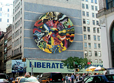
Mandala for the 21st Century. 56 feet diameter.
Porcelain enamel on steel (visualization: project pending).
Site: Corner of Broadway & Houston St. NYC.
Like many artists, Susan Kaprov tackles a full range of techniques and formats: from drawings, to large public murals installations, to photographs, to paintings that are for galleries or private collections. She has worked on paper, canvas, wood, aluminum, and produced a 54 foot enamel-on-glass wall installation. Think of it as the Picasso effect. Once one goes beyond mere formalism, then what one says can take many forms. In fact, exploring new technologies, whether digital processes or flat-bed scanners, can offer the challenges that trigger inspiration and invention. Picasso covered the gamut of format and media for his time --- from painting and printmaking to sculpture and ceramics. And although he did not tackle photography, he even tried his hand at plays and poems.
But there is a drawback. When an artist works in a number of genres, techniques, and technologies it is sometimes difficult for the casual viewer to discern continuities.
It used to be a juried exhibition commonplace that if the slides entered by one artist might conceivably comprise a group show, the artist had to be rejected. Is sticking to only one theme and image the only sign of seriousness. Or was it because galleries (and museums and critics and curators) need art that can be branded?
Fortunately, the puzzle of Kaprov’s body of work is easily solved. Some might initially have difficulty in seeing the common denominators of her jigsaw puzzle paintings, her scanner photos, and her public art commissions, but at least two things unite her oeuvre: a personal palette of bright, highly saturated color and, structurally, the assemblage of discrete units into larger wholes. The color pops out at you; it is luscious in the flower pieces, radioactive in the digital mutation images, rich and moody in the jigsaw puzzle paintings, and appropriately up-beat in the public commissions.
Color is very difficult to particularize and it takes getting to know the artist’s work to be able to pick out a palette. An exercise for art students or art historians might be the following: using paint chips, from memory assemble a Matisse palette, a Rothko palette, an Ellsworth Kelly palette and perhaps not in the too distant future a Kaprov palette. Many of my victims, I suspect, might fail. It is easier to recognize a palette than to recreate it on the spot from memory. Structure, on the other hand, is easier to remember.
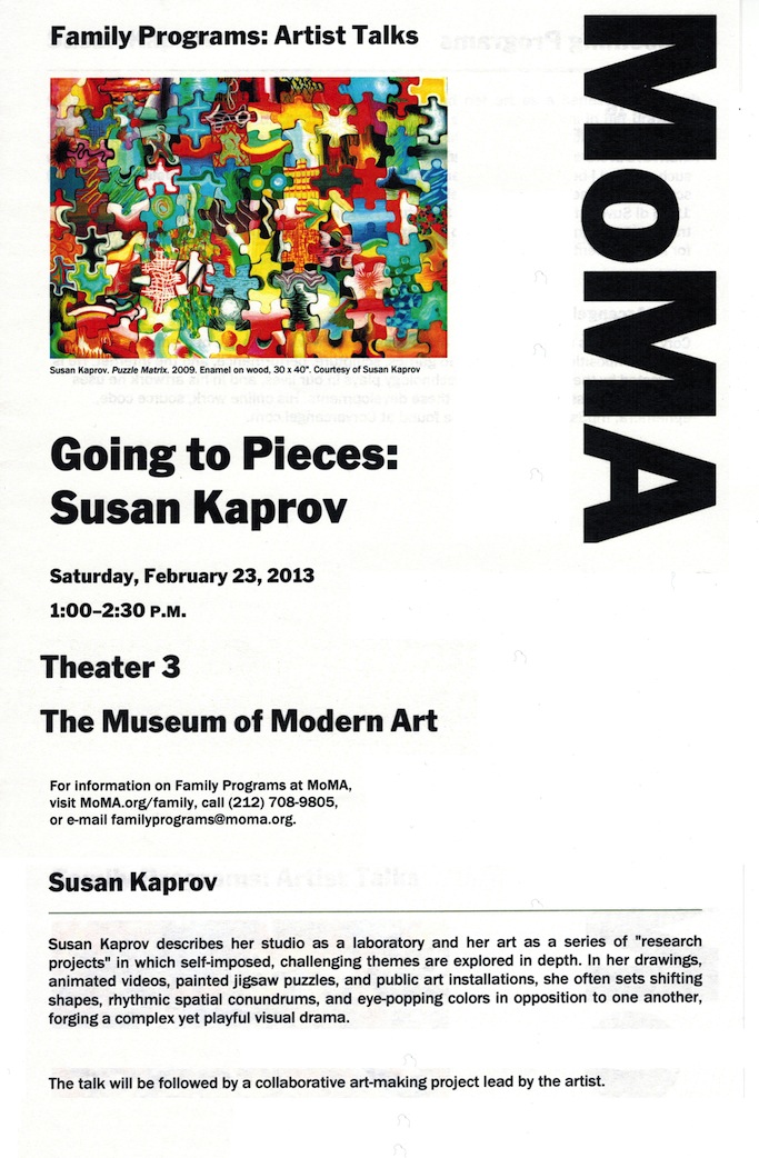
In most of the works of Kaprov’s that I’ve seen the all-over repetition of discrete units is the structural principle. In earlier works on paper such as Kingdom, in the flower scanner photographs that make up her "Nature_last modified" series, and in some of her public works such as Urban Helix (2002) at Polytechnic University the units are consciously ordered, are "composed." In other works, the units are assembled by chance, as in the jigsaw puzzle paintings or the proposal for a mural on Houston and Broadway called Mandala for the 21st Century. Kaprov says she "loves color." and she "loves to use chance," feeling that her random juxtaposition of pre-painted puzzle shapes open up the artwork to combinations that she herself---or anyone else, for that matter---could not have come up with. I agree. The freely painted puzzle shapes are in themselves small paintings; when locked together at random they create fresh and energetic fields of color and abstract paint-handling.
The big names in public art started out producing gallery art: Claes Oldenburg, Richard Serra, Christo, Dennis Oppenheim, Vito Acconci. Kaprov may be doing it the other way around. She’s already completed thirteen commissions; the gallery exhibitions will have to follow. She is already in the collection of the Brooklyn Museum (with 20th Century Dilemma, a 14 foot photomontage on aluminum done in 1983), The Air and Space Museum, the Metropolitan Museum of Art, and many other public collections.
Kaprov’s foray into public art has become a calling. At a certain point she decided that she did not like working alone all the time in her studio. Also, more people see public art than ever see art shown in galleries. To prepare herself to compete for commissions, she took courses in architecture and model-making. Eventually this paid off. She was able to communicate her vision; the commissions started rolling in.
Work space requirements are another advantage to a focus on public art competitions. Not too long ago Kaprov had to give up her Manhattan studio when the rent tripled. Since most public art is produced at factories or ateliers outside the artist’s personal work place, a huge, expensive studio is not absolutely necessary. The imagery for Urban Helix was created on Kaprov’s computer and the actual glass panels made in the famous Franz Mayer glass studio in Munich.
Kaprov, of course, now is confronted with the predicament that all artists working in the realm of public art face. With a few exceptions, the art world simply does not track, never mind evaluate, the genre. Consequently, there is little art criticism that addresses particular works or, in fact, the field as a whole. Some will answer that the works are spread far and wide, are sometimes not all that accessible, particularly if they are commissioned by corporations. Plus public art is on the whole quite wretched.
I would counter that earth works were spread far and wide and were often really, really inaccessible, but critics and historians had no problem writing about them. Furthermore, most public art is wretched because there is no art criticism. There is no feedback except occasional public outcry, usually uninformed, usually off the mark.
There’s another reason why there is virtually no art criticism about public art: the sale has already been made.
But isn’t that the case with most art shown in museums?
Not always, particularly when it comes to art borrowed for an exhibition. Besides, there’s always more work by the same artist ready for sale somewhere else, often close by.
For the record, I actually went to Brooklyn to see Kaprov’s Urban Helix, which is what inspired this more general treatment of her work. It is an easy ride on the N and to see Kaprov’s spectacular glass wall installation you don’t even have to pass the metal-detector in the lobby of the Joseph and Violet Jacobs Building on the MetroTech campus of the Polytechnic University. The theme of fractals and other scientific images totally fits the situation and the space. It’s a breathtaking piece.
A studio visit confirmed my suspicions. Kaprov is someone to watch. I particularly like the jigsaw puzzle paintings. Her flower scanner photos are gorgeous and there’s a lot to be said for the mutant vegetable images she recently showed at the Santa Barbara Museum of Art.
Where does Kaprov fit in the larger scheme of things?
Neo P& D? She certainly utilizes the grid, in an anti-minimal manner. But she does not intend the feminism or the decorative nose-thumbing of the original Patterning and Decoration movement. I’d say that since science is one of her themes the use of rational schemata is a natural. Since nature is another, saturated color is a natural too. In the meantime, her public art works multiply and certainly enliven a multitude of public spaces. Public art requires a specialized talent and Kaprov has it.
![]()
CRITIC'S NOTEBOOK; The Art of the Code, Or, at Play With DNA
Friday, March 14, 2003 (article)
It turns out that code, on rare occasions, can be visual fun. Ms. Anker’s own pieces, “Cyber-chrome Chromosome,” a set of steel wool and bronze wool X’s representing the paired chromosomes of a hippopotamus, is witty and bright. But by and large DNA artists are an earnest lot, and they tend to use the genetic code as shorthand for anti-genetic moralizing.
Kevin Clarke’s “Eight Pages from the Book of Michael Berger” is an image of a pastel-colored tower of robots, superimposed on a background of the letters ACGT, which stand for the chemical bases of DNA, adenine, cytosine, guanine and thymine. The message seems to be that a new race of robots is being built with the genetic code. And Helen and Kate Storey’s “Design 26: Spinal Column Dress,” showing a fashion photograph of a woman with a pony tail that seems to morph into a spinal column that in turn tails off into the train of a dress made of the bands of DNA sequencing gel, plays on the idea of -- what else? -- designer genes.
In the same room is Susan Kaprov’s “Garden of Altered Delights,” luridly colored photographs of a number of curious hybrid plants including the strawberry-lemon and the peppercorn. Far from being scary, these pictures make you curious and a little hungry. What do those fruits taste like?
Apparently, it is very hard to make visual hay of genetic code. Indeed, there seems to be a much more natural bridge between genetics and music. (Maybe because music, like genetics, is written in code.) At the New York Academy of Sciences, Frank Gilette’s “Broken Code (for Luria)” has stirred the score of a Gregorian chant into a swimmy-looking black-and-white abstraction about mitosis. In “Women in Science (Genomically Yours),” a small show at Universal Concepts Unlimited, a gallery in Chelsea, you can hear Susan Alexjander’s “Swquencia,” derived from the molecular frequencies of each amino acid. The music for adenine, with chimes and violin, sounds New Age. Guanine sounds spacey. Thymine is jazzy, with a hint of bluegrass.
Of the many DNA shows around New York, the most varied and diverting, if messy and makeshift, is “Genomic Issue(s): Art and Science” at the art gallery of the Graduate Center of the City University of New York, organized by Marvin Heiferman and Karen Sinsheimer. It spills out from the art gallery to the hallways and into the student lounge. In the window of the gallery, you can see Bryan Crockett’s giant mice, one sculpture foe each of the seven deadly sins. The mice, chiseled out of sparkly pink cultured marble, are the kitsch, post-genetic descendants of Michelangelo’s slaves emerging lazily from blocks of marble.
This exhibition stands out because it captures not only the moral problems but the twisted thrill of messing with nature.
![]()
May 14, 2011
Can’t afford a whole artwork? How about a fragment or detail?
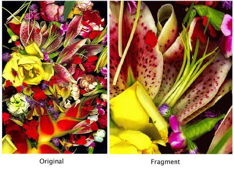
After the flooring is laid, the walls are painted and the furniture is repositioned at the end of a remodel, what’s left?
The fragments, like the one shown above right, are typically 8 by 10 inches and printed on archival paper.
The creator of these particular pieces, Susan Kaprov, lives in New York City. Her works are in the permanent collections of such museums as the Museum of Modern Art in New York, the Metropolitan Museum of Art, the Museum Boijmans van Beuningen in Rotterdam, the Yale University Art Gallery and the Corcoran Gallery of Art, among others.
Kaprov and other artists have taken part in this unique initiative by the Haydn Shaughnessy Gallery in Cork, Ireland.
According to Shaughnessy, "It’s a great way to start a collection, to remodel or redecorate the home or to give to younger people to help them start a collection and enrich their appreciation of art."
Chinese takeout boxes take artful turn at Brevard Art Museum
In Print: Thursday, July 2, 2013
Susan Kaprov
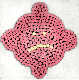
Aftermath
Flattened paper take-out carton with gas-x pills.
Melbourne is a bit of a hike across the state for most of us, two to three hours depending on starting point and traffic, but that part of our East coast is a fun getaway for many families here wanting an Atlantic beach vacation. And there are good deals to be had.
So, if you’re considering a trip to that area in July or early August, also consider stopping in at the Brevard Art Museum to see “Take Out,” one of the most whimsical theme exhibitions I have come across recently.
It features almost 200 artists (about 25 from the Tampa Bay area) whose invitation to participate included a white Chinese takeout carton that had to be the basis, starting point or inspiration for their work. The results are a wonderful example of hos creative minds approach a subject in myriad ways and should inspire those who see the show, especially children.
The interpretations are sometimes visual puns. Rick Piper’s container, which he opened and set up for The Take Out Window, adds a dummied front page of the New York Times with the headline Rival Gang Take Out Mob Boss in Chinatown. Clever.
Some are highly conceptual. Joe Griffith and Kym O’Donnell made pinhole cameras from two containers with photographs of the containers pinned behind them. David McKirdy folded one from a sheet of his signature burned dot paper as a charred origami-like vessel.
Most are interesting uses of the container’s form. Mandy Macias upends it and makes a pagoda wind chime. Dottie Stickley, Rick Dillen and Roni McCollough-Sheppard devised humorous modes of transportation from them: a wagon loaded with Silk Toad fabrics pulled by a camel; a “vintage Asian RV” faced with bamboo strips, and a padded and beaded litter, the top pole a chopstick. Rebecca Skelton retooled her container in copper, blooming from a base of leaves.
Susan Kaprov’s “Aftermath” a wryly humorous collage of gas-x pills covering a flattened take-out container was particularly witty.
Some are more inventive and technically proficient than others, but they all are reminders that creativity isn’t necessarily about creating great art; it’s more often about having fun.
If you go
Take Out
The exhibition is at the Brevard Art Museum, 1463 Highland Ave., Melbourne, through Aug. 9. Hours are 10 a.m. to 5 p.m. Tuesday through Saturday, extended to 7 p.m. Thursday, and 1 to 5 p.m. Sunday. Admission is $5 adults, $3 seniors and $2 children and students with ID. Free on Thursday. brevardartmuseum.org or (321) 242-0737. To see more examples, got to brevardartmuseum.org/flashgallery.index.asp.
See Susan Kaprov Interview in Double Exposure

http://www.giraffe.com/gr_faves.html
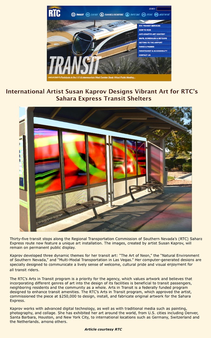
A new sports video called “Going the Distance,” by Susan Kaprov, brilliantly recreates the world of sports as a dance animation. Created for the University of Iowa’s new Carver-Hawkeye arena, the video merges animation, sports footage, choreography and intense color to produce fascinating moving films of sports in action. More of Kaprov’s work, fired enamel glass windows, can be seen at her website at www.kaprov.com
(See “Going the Distance” videos.)
©Susan Kaprov 2025. All Rights Reserved.